WOW2022 W43 Power BI vs. Tableau
WOW2022 W43 Power BI vs. Tableau
Workout Wednesday 2022 W43 challenge by Jeremy Anderson originally done in Power BI, also recreated in Tableau.
This blog aims to highlight different approach in both tools.
In the original challenge the visualization compared Sales from the current year with Sales from the prior year. I added a year selection to be able to compare previous years with their respective prior year.
Preparing the measures
Power BI
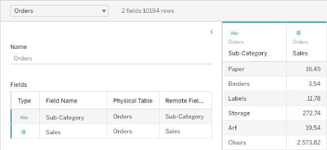
First thing, i created a date table that will help me with my calculations. Current Year and Previous Year were needed for the original challenge. I won't need them in my example.

Next i created another table that will be used for the year selection.

The Sales calculation for the selected (current) year calculates the Sales amount where the year equals the selected year.
Selected Year Sales =
CALCULATE (
[Total Sales],
FILTER (
'Date',
YEAR ( 'Date'[Date] )
= SELECTEDVALUE ( 'Year Selection'[Selected Year] )
)
)
The FILTER function is needed because otherwise i would only get the total Sales amount as soon as i bring the month in.

Sales Amount for the previous year is basically the same calculation, substracting 1 from the selected year.
Selected Previous Year Sales =
CALCULATE (
[Total Sales],
FILTER (
'Date',
YEAR ( 'Date'[Date] )
= SELECTEDVALUE ( 'Year Selection'[Selected Year] ) - 1
)
)
Then i need a calculation the % change from selected to previous year.
Total Sales Selected YoY% =
DIVIDE (
[Selected Year Sales] - [Selected Previous Year Sales],
[Selected Previous Year Sales]
)
Referencing this measure i can assign colour values for negative and positive change.
Selected YOY Colour =
SWITCH(
TRUE(),
[Total Sales Selected YoY%] > 0, "#689CCA",
"#F59C4E"
)
The last thing i need is a measure, that displays a upwards or downwards triangle based on the YoY%, followed by the absolute value formatted as percentage.
Selected YoY Indicator =
IF (
[Total Sales Selected YoY%] > 0,
"▲",
"▼"
)
& FORMAT (
ABS ( [Total Sales Selected YoY%] ), "#%")
& " YOY"
Tableau
First i had to create a parameter for the year selection.

The calculation for the selected year Sales is quite similar to the one in Power BI. I calculate the Sales value where the year equals the selected year in the parameter. Only here i don't have to worry about filter context.


I then created a calculation for the % change.

Then a calculation to check if the prior Sales value is greater than the selected.

This is then used in the calculation for the indicator text an also later to colour the positive and negative differences between selected an prior year.

Building the visuals
Power BI
The first thing i needed to do was to add a slicer based on the selected year table i created. Otherwise i would not be able to see any results, as the Sales value calculations are based on the selected value from this table.

Power BI does not have a bullet chart out of the box, so i had to use the custom Bullet Chart by OKVIZ visual.
Here i added the month name for category, selected year Sales as value and prior year Sales as target.
Here i added the month name for category, selected year Sales as value and prior year Sales as target.

I then assigned blue as the default colour.

And orange as conditional colour.

I added another bullet chart for the categories with the same settings, except with horizontal orientation.
Then two cards, one for the selected Sales Value and one for the indicator text.

Tableau
For the bullet chart by month, i created a dual axis chart with the selected year Sales value as a bar chart and the prior year as gant chart.
for the conditional formatting i applied the Selected vs. Prior calculation to colour.

I created another chart for the Sales by category just the same with swapped rows and columns.
Then one worksheet with the selected Sales measure and one worksheet with the Yoy Indicator measure.
Building the dashboard
Power BI
This was just about arranging all my elements according to the WOW challenge requirements.
I won't describe this in detail, just point out some points that helped to build the final result.
Rounded edges can be applied in the general formatting section.

For the legend, i added shapes and text.

Tableau
I created a tiled layout with all my elements and the YoY indicator as a floating container above the Selected Year Sales.
For the legend i created two worksheets for the dots with round shapes. The line for Prior Year is constructed out of 3 blank containers. the one in the middle with 3 pixel height and a black background.

Now i had the layout i wanted, but i was missing the rounded corners from the original.

As Tableau does not offer rounded edges for the containers, i decided to use background images for the containers and place the visual on top as a floating element.
To match the size of the containers and to have more control over the edge shape, i loaded a screenshot into GIMP, selected the element i wanted with a round corner selection.
This way i created a background picture for each element that required rounded corners.

Everything else was just formatting and applying colours.
If you would have done anything differently, especially the rounded corner containers in Tableau, please leave a comment.
Thanks again to the WOW team for this challenge.


Comments
Post a Comment