WOW2022 W50 Tableau vs. Power BI
WOW2022 W50 Tableau vs. Power BI
Workout Wednesday 2022 W50 challenge by Erica Hughes originally done in Tableau, also recreated in Power BI.
In this blog i describe the different approach in both tools.
Comments and suggestions on how these could have been done differentare more than welcome.
Preparation
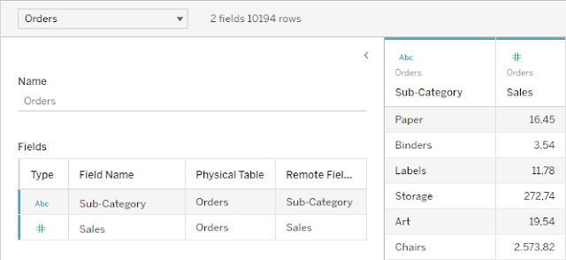
In both tools i hid/deleted all the fields not required for this exercise.
Tableau
I created two parameters.
One for the selection of the sort order.

And another parameter for the top n selection.

Power BI
Here i had to create tables for the sort order and top n selection.
For the 'Sort by' table i entered the values after selecting Enter Data.


To avoid that i had to enter all the values manually i let Power BI create a table with the range in Power Query Editor.
I got the code from this forum entry: https://community.powerbi.com/t5/Desktop/Create-A-Number-Table/m-p/139332#M59893
I created a new query and entered the following code in Advanced Editor:
let
Source = List.Generate(()=>1, each _ < 100, each _ + 1),
#"Converted to Table" = Table.FromList(Source, Splitter.SplitByNothing(), 1, 100, ExtraValues.Error)
in
#"Converted to Table"
I added a custom column with the double digit value of the column i created to be able to sort the values properly.


Building the measures
Tableau
For the Sales Amount by Sub-Category, i created a measure excluding the Product Name. This was necessary as i need the Product Name later in the Worksheet in order to be able to include it as a field in table calculation for the Top n Sales Amount.

For the Top n Sales Amount i used WINDOW_SUM on the SUM of Sales where the index is less or equal the Top n selection. Later in the visual this will refer to the Product Name by Sub-Category.

The 3rd measure is the Percentage of Total for the selected Top n Products.

When selecting 'Percent of Total' from the parameter the chart should be displayed as a 100%% stacked bar chart.
For this i needed to create two calculated fields based on the previously calculated Sales Amounts that i can use in the visual.
For the overall Sales by Sub-Category, when 'Percent of Total' is selected i set the value to MIN(1), amounting to 100% for all Sub-Categories.

For the Top n Sales Amount, when 'Percent of Total' is selected, i display the previosly calculated % of total.

To change the sort order based on the selection i needed to create another calculated field that will be the first row entry in the visual and hence dictate the sort order.

Power BI
First i created a measure for the Top N Sales Amount.
Sales Amount Top n =
VAR _TopNProduct =
GENERATE (
VALUES ( Orders[Sub-Category] ),
TOPN (
SELECTEDVALUE ( n[Value] ),
VALUES ( Orders[Product Name] ),
[Sales Amount]
)
)
RETURN
CALCULATE (
[Sales Amount],
KEEPFILTERS ( _TopNProduct )
)
With the GENERATE function i evaluate the TopN by Product Name for each row in a table that contains only the Sub-Categories.
The VALUES function creates a Table with the values from the referenced column.

The TOPN returns the number of top Products based on Sales Amount. In this example 3 as i don't have a selector that would give me a selected value.

Combined in the GENERATE function i get the top 3 Products by Sub-Category in return.

I could not figure out how to display the Sales Amount for the Top n as a a part of the total Sales amount in the Stacked bar chart visual.
In Tableau, with the Dual axis chart, i practically overlay both chart and as a result, the Top n Sales Amount is displayed as a part of the total Sales Amount.
In Power BI, it adds the total Sales Amount to the Top n Sales Amount.

I decided to take a shortcut and combine the Top n Sales Amount with the Total Sales Amount minus the Top n Sales Amount in the visual. For this i needed another measure.
Sales Amount visual =
[Sales Amount] - [Sales Amount Top n]
To change the visual to a 100% stacked bar chart when 'Percent of Total' is selected i also needed to create 2 new measures based on the previously calculated Sales Amounts that will then be used in the visual.
For the Top n Amount:
Amount top n =
SWITCH (
SELECTEDVALUE ( 'Sort by'[Value] ),
"Sales Value", [Sales Amount Top n]
,
"Top n Sales", [Sales Amount Top n]
,
"Percent of Total", [Percentage]
)
with
Percentage =
DIVIDE (
[Sales Amount Top n],
[Sales Amount]
)
And for the Total Amount minus the Top n Amount:
Amount =
SWITCH (
SELECTEDVALUE ( 'Sort by'[Value] ),
"Sales Value", [Sales Amount visual]
,
"Top n Sales", [Sales Amount visual]
,
"Percent of Total", [Sales % of Total]
)
with
Sales % of Total =
1 - [Percentage]
I also needed a measure that would allow me to change the sort order based on selection.
Sort by =
SWITCH (
SELECTEDVALUE ( 'Sort by'[Value] ),
"Sales Value", [Sales Amount]
,
"Top n Sales", [Sales Amount Top n]
,
"Percent of Total", [Percentage]
)
Building the visuals
Tableau
What i want to get as a result is a dual axis bar chart with the total Sales Amount by Sub-Category and the Top n Sales Amount by Sub-Category.
When i place both calculated fields in the Columns section, the Top n amount is the same value for all Sub-Categories.

I need the value to be calculated by Product Name, restarting each Sub-Category.
To be able to reference the Product Name, i add it to the Details Mark Card and then configure the Table Calculation for the Sales Top n as follows.
To be able to reference the Product Name, i add it to the Details Mark Card and then configure the Table Calculation for the Sales Top n as follows.

To get rid of all the excess Products in the view, i add an Index to the filter pane, compute using the Product Name and set it to 1.

Now i can create the dual axis chart.

To complete the graph, i needed to add the Top n Percentage as discrete value and the Sort by field. For both fields i had to adjust the table calculation and then hid the header for the Sort by field.

For the tooltip i created a calculated field that displays the Sales Value for each selection, except for 'Percent of Total'.

Everything else was just formatting and bringing everything together on a Dashboard.
Power BI
I added the Sales Amount Top n and the Sales Amount visual (Total Sales Amount - Sales Amount Top n) to a Stacked bar chart visual.
To be able to see result i also needed to add a slicer based on the n value table, otherwise i would not have a selected value in my measure calculation.

This enables me to utilize this field as Sort Axis.

The downside is, that now this field will also be displayed in the tooltip.

I already create a measure for what i want to display in the tooltip.
Tooltip =
"The Top "
& SELECTEDVALUE ( n[Value] ) & " Products make up "
& FORMAT (
[Percentage],
"#%"
) & " of the total Sales for "
& SELECTEDVALUE ( Orders[Sub-Category] ) & " "
& FORMAT (
[Sales Amount] / 1000,
"$#0K"
)
To only have this text displayed in the tooltip, i created a tooltip page with a card visual and used this Report Page as tooltip.


In Power BI i cannot add the percentage as an additional column to the Stacked bar chart visual.
To include the percentage value in the visual i had to create a workaround.
I decided to add another bar chart visual with only the Percentage on the x-axis and Data labels displayed. I changed the colour of the bars to white and placed the other visual on top of that.
The Sort by measure was placed on the Tooltips as well with tooltips off.

From here on it was again adjusting the formatting/colours and arranging all the elements.
One thing i was not able to achieve was to display the Data labels for the Total Amount of Sales to the bars.
Mainly because i did not use the full Total Amount, but the Total minus the Top n Amount.
Enabling Data labels would display the wrong amount.

Then for the title i added 'How much did the Top n Products...' instead of including the actual number of top products.
I could have done this by creating a measure that includes the actual selected n value. But then i would not have been able format the text and highlight 'Top n Products' the with the green colour.
Conclusion
In terms of formatting and customizing your visuals, Tableau offers much more flexibility.
Some things i was just not able to achieve in Power BI or had to fake some aspects of the end result.
As someone who always struggles with table calculations in Tableau, meaning there's a lot of trial an error, it was much easier to get the results i wanted in Power BI.
The ability to reference virtual tables in calculation makes the process, at least for me, much more tangible.
In the end i cannot say one tool is better than the other. Both do certain things very well and others you just might to have to get used to.
The clear advantage Tableau has over Power BI is the sheer amount of options at your disposal when it comes to build and customize your visual along with formatting and colour coding.

Comments
Post a Comment