WOW2023 W02 Power BI vs. Tableau
WOW2022 W43 Power BI vs. Tableau
Workout Wednesday 2023 W02 challenge by Meagan Longoria originally done in Power BI, also recreated in Tableau.
This blog aims to highlight different approach in both tools.
First thing, i was not able to replicate all the aspects of the original Power BI visualization in Tableau and for some aspects, there was a certain amount of manual adjustments necessary.
I basically ended up with two versions and i will address them both.
Preparation
Power BI
As i need a continuous date axis, I created a Date table and then relationships between the 3 tables based on the date field.


Tableau
I created a relationship between the xls and csv based on the date fields.
Building the first 3 (top row) area charts
Power BI
I needed different start dates for the graphs from where i would calculate the % difference, so i had to create 3 different measures with the respective start date as reference.
Not every date has a closing amount, this is why i needed to check for those instances (blank fields) and leave them blank, rather than calculating the % difference which would have resulted in a 0 value.
% change 2019-2022 =
var _startAmount = CALCULATE (
SUM ( Wk2HistoricalData[Close/Last] ),
'Date'[Date] = DATE ( 2019, 12, 31 ))
var _nextAmount = CALCULATE(
SUM(Wk2HistoricalData[Close/Last]))
var _result = IF (
ISBLANK ( _nextAmount ),
BLANK (),
DIVIDE (_nextAmount - _startAmount, _startAmount ))
return _result
With these 3 measures i can already build the first 3 area charts.
However, i want to have different colours for positive and negative values. But i can only assign one colour to an area chart.


Those two measures can then be placed on the Y-axis, overlapping each other. This creates the full chart with positive and negative values and control over both colours.


The calculation for those two charts is also different, as they are also used in the two bottom charts where i want to filter the event category.
This required to add a CALCULATE function and remove all filters from the event category, so this calculation won't be affected by the filter.
positive 2020-2022 =
CALCULATE (
IF (
[% change 2020-2022] >= 0,
[% change 2020-2022],
0
),
ALL ( Wk2Events[Event Category] )
)
Tableau
In Tableau i am facing the same challenge that i cannot assign different colours to positive/negative values. That works with a bar or line chart, but not with the area chart.
So i also needed to create calculations for positive and negative values and combine them.
For the % difference it was enough to create one calculation to determine the Close/Last amount for the start date and then one calculation for the % difference referencing this field.
Using the date as context filter would then determine the correct start date so there's no need to hardcode those dates as i had to do in Power BI..


With these 2 calculations i then could build a dual axis area chart.

For the graphs with later start dates i had to make sure to add the date filter to context in order to calculate the start date before any other filters or table calculations are applied.

This is due to the order of operations in Tableau. Fixed LODs like the one we used to calculate the start amount are applied before Dimension filters, such as the date filter, are applied.
That means, the start date for the calculation won't change based on the filter selection, because it is applied after the LOD for the minimum date.
Changing the filter to context filter sets the date filter first, that means the LOD for the minimum date will use the filtered date value.

Building the last 2 (bottom row) area charts
Power BI
Those two charts are basically copies of the first chart in the first row (2021-2022) with adjusted date filter and stepped lines enabled.

Tableau
Tableau does not offer a stepped area chart out of the box. To create one, it needs another calculated field.
To build the graph, i start with the % Difference that was used for the other graphs change from Automatic to Area.
I then drag the % Difference previous on the Y axis of the graph, change to area chart and remove the Measure Names from the Colour Mark.

Now that gives me a stepped area chart for all (positive and negative) values. .To be able to apply a different colour to positive and negative values i would need to combine a positive and negative stepped area chart as i did before adding all measures for positive and negative values just creates a mess.

I decided to split the graph into 2 separate worksheets, one with positive and one with negative values, and combine them in the dashboard so it would look like one chart.


This is what the combined charts will look like on the dashboard.
To get the correct sizing of the negative and positive chart, i measured the size of the graph in pixel and then calculated the height based on the size of the combined values.

Creating the markers
In all graphs there should be a marker for the last % value in the timeline.
In addition to that the lower 2 graphs need to have markers for events during these time periods.
Power BI
To mark the value for the last date i had to create 3 measures with the fixed date for December 30th 2022.
max 2019-2022 = IF( SELECTEDVALUE('Date'[Date]) = DATE ( 2022, 12, 30 ),
[% change 2019-2022])
As the first chart in the second row has a different end date than all the others, this needed another measure only for this chart.
-21% = IF( SELECTEDVALUE('Date'[Date]) = DATE ( 2022, 06, 30 ),
[% change 2021-2022])
For the event marker i created 2 measures for each Half Year respectively.

To add the markers to the chart, i simply needed to add them to the Y-axis.

To display only the label for the last % difference i enabled Series labels. This would display 'max 2020-2022' in the graph, so i had to rename the measure for this visual. Actually i had to rename all measures to something short, otherwise they would occupy the space to the right of the chart, even when not visible.

Tableau
To highlight the last value in the 3 charts in the top row i created a calculated field that will display the % difference for the last entry in the date field.

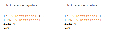
As the marker for negative value should be displayed in a red colour and for positive values in green i created two calculated fields for that.
I could have done with one field checking for +/- values. But then i would need an additional calculation when it comes to colouring the events in the bottom 2 graphs, so i stuck with two identical calculations for positive/negative.

I added the Last Marker calculated field to the Rows shelf and created a dual axis chart.

I then created a parameter based on the event category measure that would allow to filter by event category. To be able to show the marker for all events i added All to the list.

Then i needed a calculated field that will return the selected category.

For the event marker for the bottom 2 graphs i created a calculation that would give me the % Difference when events occur (count >0) and also for the last entry (last() = 0).

I then added the Event Marker calculated field to the Rows shelf and created a dual axis chart as i did before withe the Last Marker.

Adding the reference line
Power BI
Here i added a X-Axis Constant Line with conditional formatting.
As the line should change position, indicating the date of the first event I applied field values from the following measure:
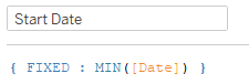
Earliest Event Date =
Calculate(
MIN('Date'[Date]),
Wk2Events)

Tableau
I created a calculated field that would return the event dates based on the parameter selection.

Then added that calculation to the Detail Marks Card with MIN aggregation and created a reference line based on that field.

Tooltips
Power BI
Events should only be displayed for dates where events occurred so I created a Tooltip page that would display dynamic values.
For this i had to create measures for each text i wanted to display.

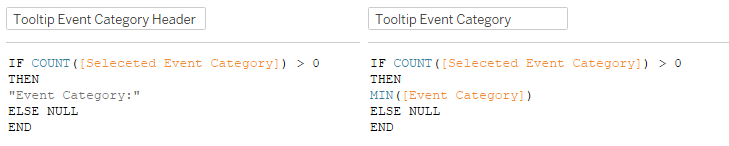
EventCategoryLabel =
IF (
COUNT ( Wk2Events[Event Category] ) > 0,
"Event Category:",
""
)
SelectedEventCategory = SELECTEDVALUE(Wk2Events[Event Category])
EventDescriptionLabel =
IF (
COUNT ( Wk2Events[Event Description] ) > 0,
"Event:",
""
)
SelectedEventDescription = SELECTEDVALUE(Wk2Events[Event Description])
I then added a text field and entered values for each of these measures.

Tableau
In order to only display the Events in the tooltip where events occurred I also needed to create calculated fields for that.


From here it was arranging the elements and formatting.
In Tableau i had to do quite a number of manual adjustments to display the bottom two charts properly.
Especially with getting the size of the positive and negative chart right.
I created the bottom two charts without a stepped area chart where i would have to use only two charts instead of 4 and the sizing is correct by default and the stepped chart looks quite good in comparison.

Any ideas on how to do this differently are much appreciated.
Here is a link to my Power BI pbix file:
And to Tableau Public:


Comments
Post a Comment